CSS3 Transitions Transforms & Animation : Tutorials & Examples
CSS3 Transitions – Are We There Yet?
Cascading Style Sheets 3 has been available for “some time” (first time introduced nine years ago). However, CSS3 hasn’t been available in common use for more than two years.CSS3 Transitions in real use were introduced in late 2007 by Safari. At that time, they were referred as “CSS Animations”, but the terminology changed when Safari introduced their proprietary features also called CSS Animations
Using CSS3 Transitions, Transforms and Animation
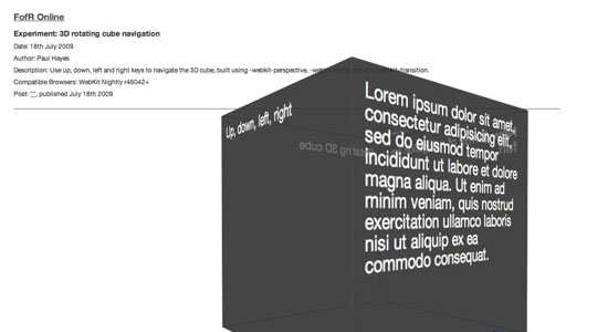
First things first - these demos are showing of CSS transitions, transforms (2D and 3D) and animations. Currently (May 2010), transitions and 2D transforms are available in all current browsers (at least in a dev build) apart from Internet Explorer, 3D transforms and animations are only in Safari. Most examples degrade nicely, so if you are using a legacy browser you can still use a site using these, you just won't get animation. 3D transforms generally don't degrade nicely, so be careful when using them.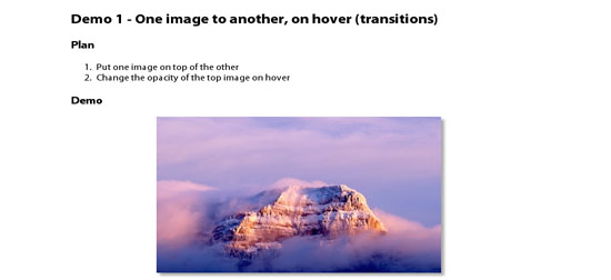
CSS Fundamentals: CSS 3 Transitions
As CSS3 rolls out around the web, it is bringing some interesting new presentational techniques along with it. Today, we’ll review the basics of using CSS3 transitions and animations to add an extra layer of polish.
CSS: Animation Using CSS Transforms
The examples on this page will work properly in Safari and Chrome and Opera. In the latest Firefox release you will see the transforms, but without any animation (though it's coming soon). If you're still using Internet Explorer nothing on this page will make much sense.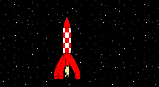
Using CSS3 Transitions to create rich effects
There has been discussions about allowing CSS to help developers create smooth transitions of CSS properties for elements, and it’s something being specified in CSS3 in W3C CSS Transitions Module Level 3. Here I’m going to show you how to implement it in Firefox, Google Chrome, Safari & Opera.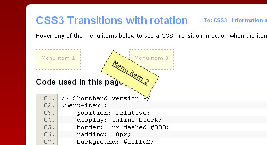
CSS3 transitions and 2D transforms
For richer user interfaces it is often desirable to include some animation to make an effect smoother or more appealing, or effects such as rotating elements and text. Traditionally in HTML pages the primary means to add animations was to use JavaScript to adjust the desired CSS property value over a given period of time. This works but can be slower as the JavaScript code is not hardware or software accelerated. What's more, using JavaScript for animations creates more code to maintain. It has not been possible to apply effects such as text at an angle without resorting to using images or SVG.
Going Nuts with CSS Transitions
I’m going to show you how CSS 3 transforms and WebKit transitions can add zing to the way you present images on your site.
CSS3 Starbursts
I was recently experimenting with the new CSS3 rotation property and it occurred to me that I could use this to create image-free starbursts. All I needed was a series of nested block-level elements each rotated by a slightly different amount. The rotation would distribute the box corners around the circumference of the star.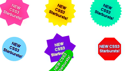
CSS3 Animation Will Rock Your World by Jonathan
There's been a lot of hullaballoo on the 'tubes about the Safari 4 beta – fast javascript engine, new UI elements (that we're not all sold on), coverflow, full-page zoom and about 140 other features. What's got the online world all hot and bothered though is CSS animation, part of the proposed spec for CSS3.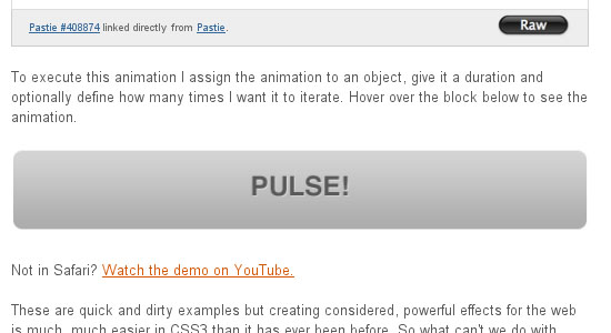
Gotta’ love HTML5 & CSS3
With the arrival of HTML5 & CSS3, web designers all over the world have had different reactions. Some see this as a great opportunity for creating “a better web”, but know that there is still some years to go for seeing it implemented completely, so they are sticking to good old xHTML & CSS 2.1. Others, however, can’t wait for the future and are developing (some pretty cool stuff, I have to say) using these latest technologies.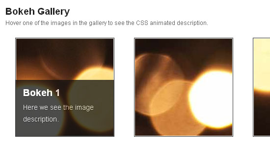
Easily Turn Your Images Into Polaroids with CSS3
Yesterday, Jon and I were going back and forth about what to blog about next. Love of CSS and doing something cool with it is kind of our thing and we quickly jumped on a brand new idea: polaroid style images with just CSS. Holy super awesome, Batman!
CSS3 3D Tutorials & Demos
 Twitter
 Facebook
 RSS
RSS