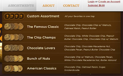
Great Examples & Tutorials Of Mega Drop-Down Menu - As a general rule, most Web developers, especially usability enthusiasts, say it is bad practice to use drop-down menus because they are confusing, annoying and oftentimes dysfunctional. From a
design standpoint, however, drop-down menus are an excellent feature because they help clean up a busy layout. If structured correctly, drop-down menus can be a great navigation tool, while still being a usable and attractive design feature.Yes, that’s right: drop-down navigation menus can be user-friendly. Just yesterday Jacob Nielsen the results of his recent drop-down menus study, in which he found out that big, two-dimensional drop-down panels that group navigation options help users to avoid scrolling and can precisely explain the user’s choices with effective use of
typography, icons, and tooltips.

A perfect website is the result of the application of several techniques that come from different fields. The most famous trends in the modern web design are just the perfect combination among rules from design, web usability, user interface design, science behind HTML, CSS and Javascript.A relatively recent trend is the use of mega drop-down navigation menus. They are simple to build and have a great appeal for the users.

Mega drop-down menus are characterized by large panels divided into groups of navigation options. By structuring navigation choices through the use of layout, typography, and icons, everything is visible at once which avoids the need to scroll.

The Navigation Menu plays a key role in any website, either it is a drop-down or a simple one. Its ok for small sites with 5 to 6 menu items, you will have more options to present the menu with better navigation by giving good look and feel by taking the latest web trends & usability into consideration.But what if you have a huge portal or a site with lots of content to feature to the visitors of your site? That’s the first and main question comes to every designer and developer before they plan to develop a website. It’s the same case with me – I always dig into different kind of sites like magazine, news, huge portals etc. to find how others are giving better navigation – the different ways/approaches to present the menu by highlighting their key sections/parts of their site.

While in the process of redesigning 4wheelparts.com, I decided to explore new methods of working with our huge number of inventory and categories. I did some research and noticed a new trend for ecommerce sites in having what they call “mega drop down menus”.

Mega drop-down menus are not actually new, but more and more we see them on popular websites and blogs. With the ever increasing quantity of content on the web we have to figure out solutions to display content and navigation but still keep everything usable and provide a good user experience. It’s no wonder mega drop-downs are now used more often.Today we’ll take a look at creating a simple HTML site with a horizontal navigation bar where a menu item will have a mega drop-down attached to it. I used jQuery for the drop-down and some CSS3 for the rounded corners.

loading..


 Twitter
 Facebook
 RSS
RSS